
Helping Seattleites better understand OPA’s role and services in safeguarding a culture police accountability.

My Role
I managed/ led the website re-design team to update and refresh the Office of Police Accountability’s website.
Project Management
Information Architecture
User Research & Testing
OVERVIEW
The Office of Police Accountability (OPA) is part of Seattle’s police accountability system. OPA investigates complaints against Seattle Police Department officers (think Internal Affairs). Anyone can make a complaint. OPA provides independent oversight, supported by a mix of civilian and sworn staff and a Director who makes decisions on allegations free from outside influence. Most people don’t know about OPA. Among those that do, most learn about OPA through news media, often related to high profile cases such as an officer-involved shooting.
Challenges
OPA has changed a lot in the past couple years, and the web content was outdated.
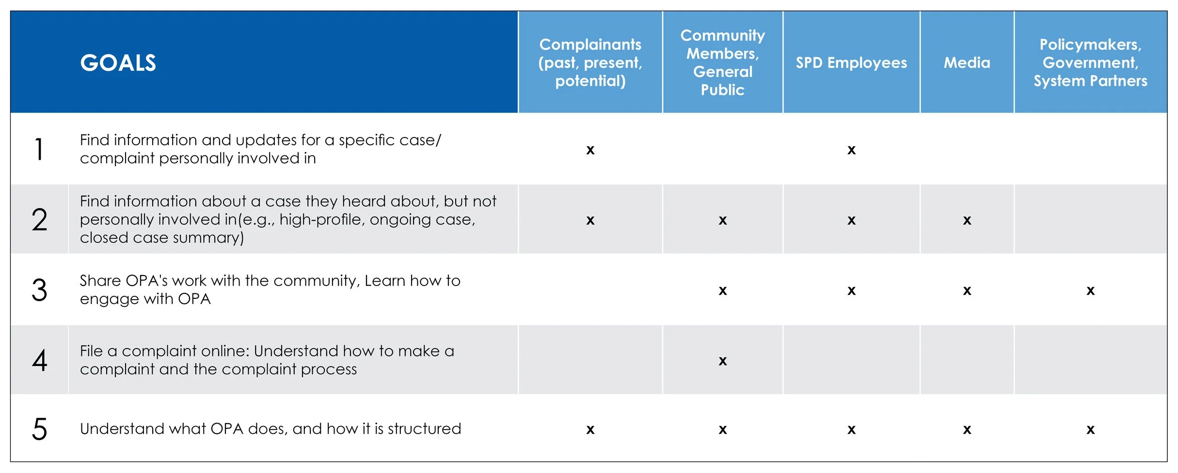
OPA serves two unique audiences- the general public, who can file a complaint of misconduct about a Seattle Police Department (SPD) employee, and SPD employees named in a complaint.
The current site was text heavy, and its information was not easily accessible to a wide audience due to the technical nature of the office’s services and processes and somewhat abstract concepts.
The site’s navigation did not help users easily find what they were looking for.
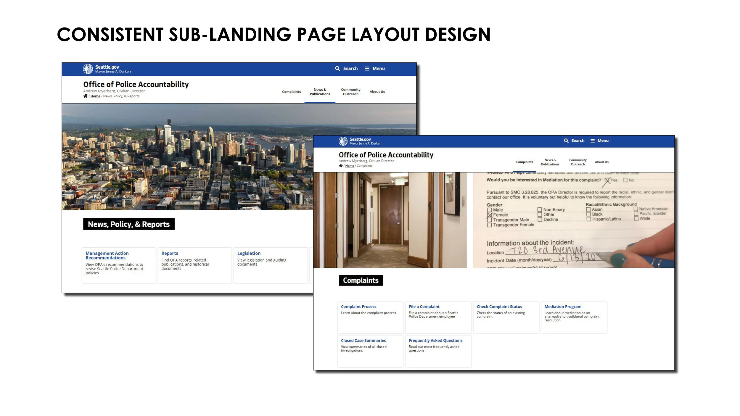
Summary of Design Solutions
Revised sitemap
Improved navigation
Updated page content to make concepts more accessible to wide audience
Revised page layout designs to aid in site navigation and finding information

DESIGN PROCESS
[insert image here of design process flow chart or graphic]
- Project Goal Setting -
The team worked together to define goals for the updated website.
- Understand -
Research Methods
Web Analytics
User Personas
Competitive Analysis
Card Sort & Tree Tests - Information Architecture
User Testing - current and re-design page designs
Constraints
The City of Seattle has design guidelines for all organizations and offices within City government. These include preferred fonts and colors and limited page layout and design options. These constraints help create consistency across City offices and departments, ensuring the information, content, and design meets accessibility requirements for government and public services that serve a diverse community.

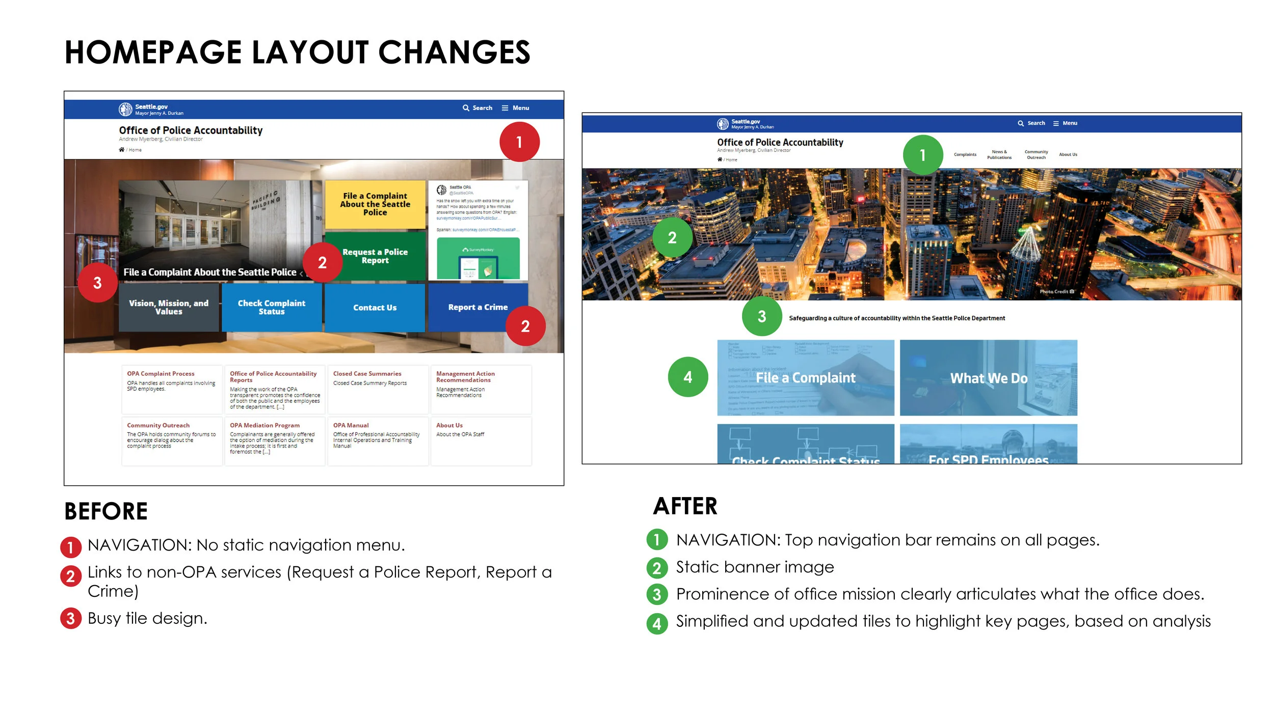
OPA Homepage Before Redesign
User Testing: Current Website
3 user interviews were conducted on the current website. Users were asked to complete several tasks: find out what OPA does, find out where/how to file a complaint, find information on a current high-profile case they heard about in the news.
Key Findings:
Filing and checking a complaint are easy to find and do from the homepage.
The homepage contains several tiles and main headings that are confusing or are not related to OPA.
Users want to find out who is in the organization. Knowing the people and staff that make up OPA is valuable information. This was not easy to find.
Users were unable to find information on cases they have heard about in the news.
In general, the website is very text heavy and lacks more appealing visuals that could explain the information.
User Personas
We created user personas to help keep track of the key kinds of users that may visit the OPA website.

Designed by Kristina Adams
- Information Architecture -
Revise Sitemap
Through the early user interviews it was apparent that the site navigation was not the most intuitive to achieve certain goals. We decided to revise the site’s information architecture and update the sitemap. We received feedback from users through open card sorts to inform a revised sitemap, and then tested the new structure with additional users through a tree test asking them to complete specific tasks. The revised sitemap reflects the user input from these two activities.


Designed by Kristina Adams
- Update Page Content -
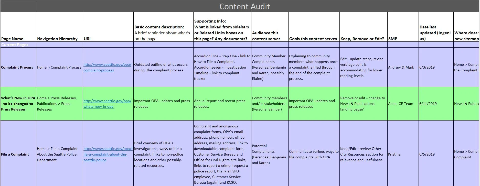
In this step, the team tackled updating content on all web pages under the new site map. This step included a Content Audit and revisions to ensure technical information about the office’s services and funcitons are accessible. This was achieved through language changes and making text easy to skim and digestible.
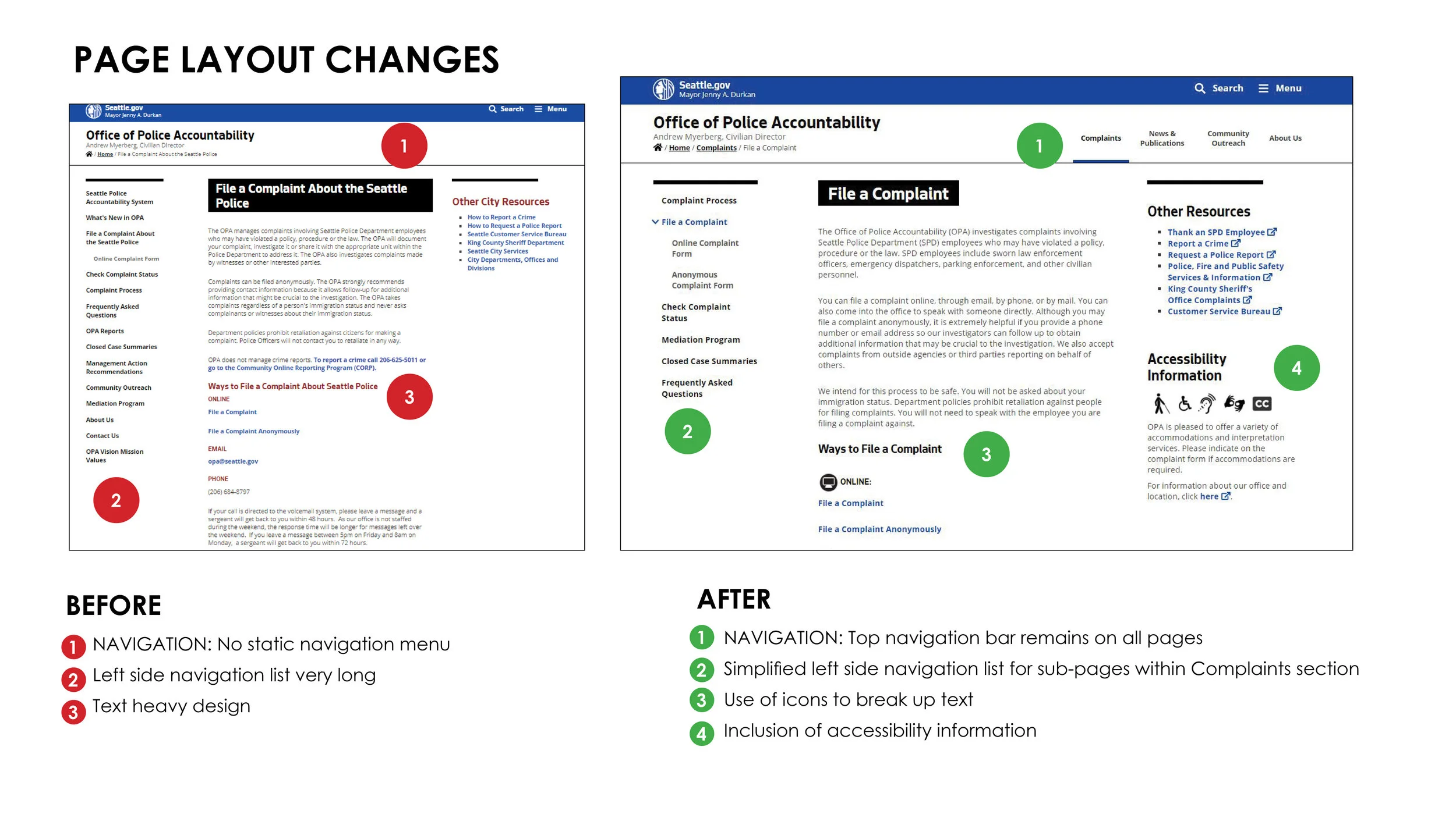
- Revise Page Layouts & Design -
Worked with Seattle IT to update layout and navigation.
REFLECTIONS
Write about what I learned on this project, what was challenging, surprising, or what I would do differently next time.